The challenge
Global Ministries is the mission and humanitarian agency of The United Methodist Church, working in more than 115 countries. Its work is deep and wide-ranging, with powerful stories to tell, and it was ready for a website that could tell them clearly and give every visitor a meaningful way to take part.
The organization serves 10 audiences, from individual donors to church leaders and grant seekers, and its site was organized around its programs. The opportunity was to organize it around how visitors think: most come to understand the work, give, or get involved.
The approach
The key call was who to design for first.
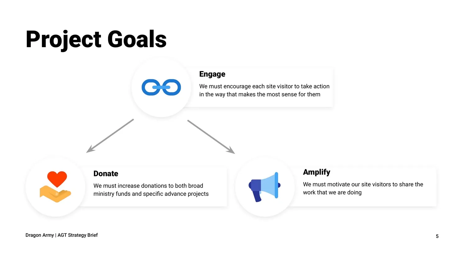
With 10 audiences, designing for everyone equally would have meant designing for no one. I turned the mission into three measurable goals, each tied to specific actions: Donate to ministry funds and projects, Amplify the work by sharing stories and resources, and Engage by praying, volunteering, or applying to serve. Then I put the audiences most likely to take those actions first, gave the rest clear secondary paths, and built a measurement plan for each goal.
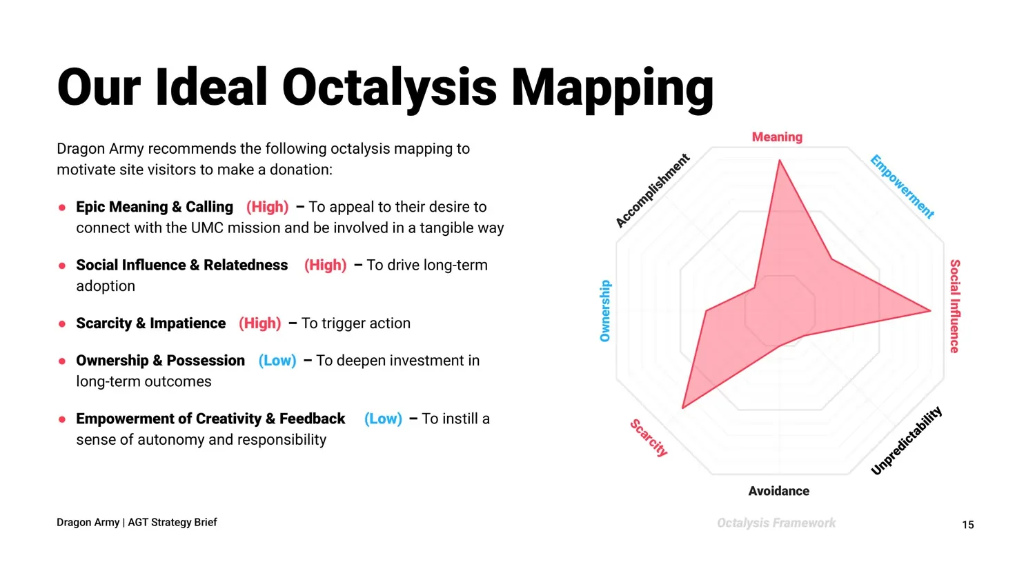
Using Applied Game Theory™, I mapped what would motivate each action: meaning first, showing visitors their part in something bigger; then belonging, like showing how many people are praying for a cause; and for disaster relief, urgency that’s honest about what a gift can do today.
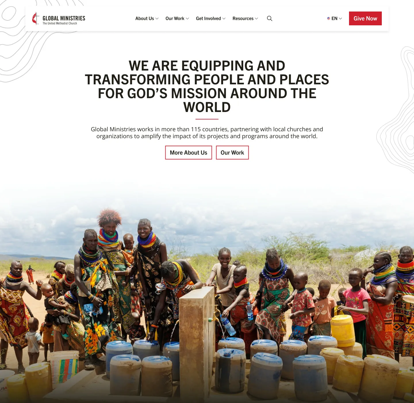
A card sort with the Global Ministries team pointed the same way. Participants grouped content by what visitors want to do, not by program, so the new navigation followed suit: About Us, Our Work, Get Involved, Resources, and a Give Now button in the header.
I also led the CMS evaluation, using the scoring framework I built for Great Clips (WordPress scored highest at 82%), and wrote the functional requirements the team built from.
The design
The motivation strategy shows up directly in the interface.
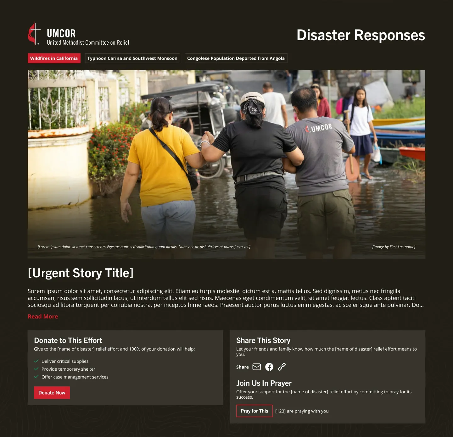
- Disaster responses on the home page: each urgent story pairs three ways to help side by side: donate to the effort, share the story, or pray for it, with a count of how many others are praying.
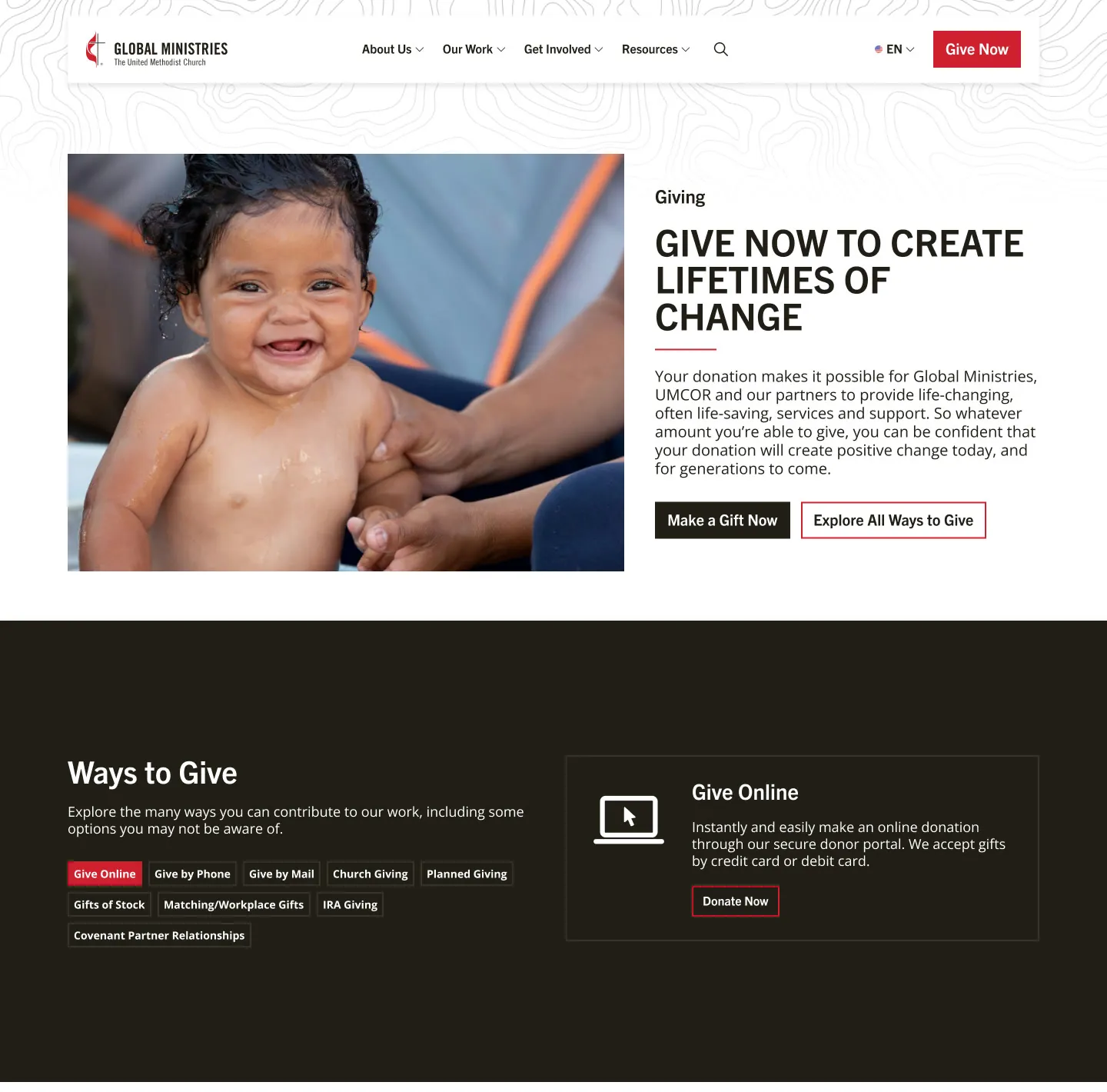
- A giving page built for every kind of donor: from a one-time gift to stocks, IRA gifts, and planned giving, with the Advance showing that 100% of a gift reaches the project.
- Navigation built from the card sort: large, clearly labeled menus, with Give Now always in the header.
Testing and iterating
Midway through design, my team ran a user study with eight participants to test navigation, the Our Work pages, and giving.
Every participant found the Give Now button easily, and everyone found how to give stock, rating it 4.9 out of 5 for ease. Nearly every participant chose the right menu link on four of five navigation tasks; the fifth confirmed a direct “Become a missionary” link we had just added.
The study also pointed to one opportunity: from the home page header alone, half of participants weren’t yet sure what Global Ministries does, so we recommended a more explicit headline and introduction.
Moving the content
The site held nearly a thousand pages. Using the migration process I built after Cox Media, I created the content inventory and migration plan, mapping pages to their new home or to a redirect. Our SEO specialist validated the redirect plan before launch.
Launch and results
Within four months of launch, recurring online donations increased 314%. Within six months, average engagement time rose 14.2%, and time per session rose 12.4%.
What I learned
This project put me in an unfamiliar world. The United Methodist Church has its own language, from the Advance to annual conferences, and a structure that’s genuinely complex. I couldn’t build a meaningful strategy until I truly understood it, and I had to get there quickly.
So I designed and facilitated a series of conversations with different groups across the organization. They taught me how the work actually fits together, and they made the strategy something we shaped together rather than something I handed over. Working through that complexity side by side is how we got to a site that delivered real results.