The challenge
Great Clips’ Online Check-In lets customers join the waitlist before they leave home. The new GreatClips.com needed to make it the obvious choice.
Before designing anything, my team audited the site, tested it with real users, and surveyed 1,000 customers. The homepage tried to serve too many audiences, the stock-style imagery skewed male, and important content was hard to find.
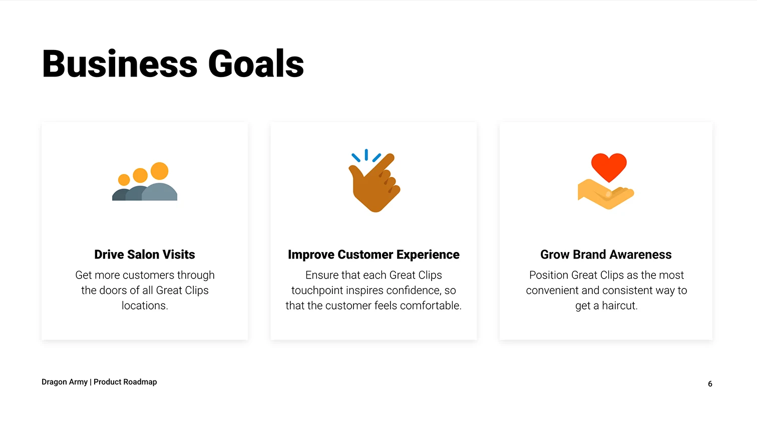
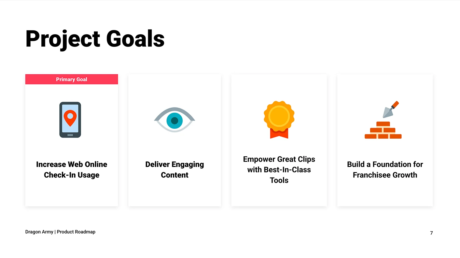
Those findings shaped the product roadmap I built, which tied four project goals to Great Clips’ three business goals, with web online check-in as the primary goal.
The approach
Customers come back about every six weeks, but they start to notice they need a cut around week four. Those two weeks were the opportunity.
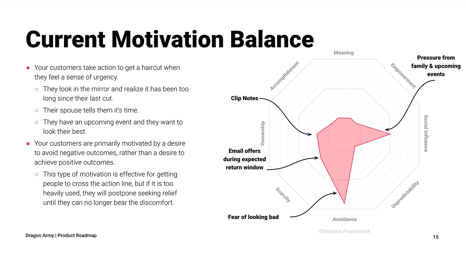
Using Applied Game Theory™, I found that people get a haircut out of urgency: the mirror, a spouse, an upcoming event. That kind of avoidance gets people through the door, but it also makes them put the visit off as long as they can. My projection showed that bringing the average return time down to four weeks would raise annual value per customer by 50% for men and 100% for women.
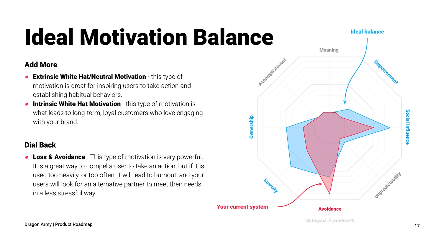
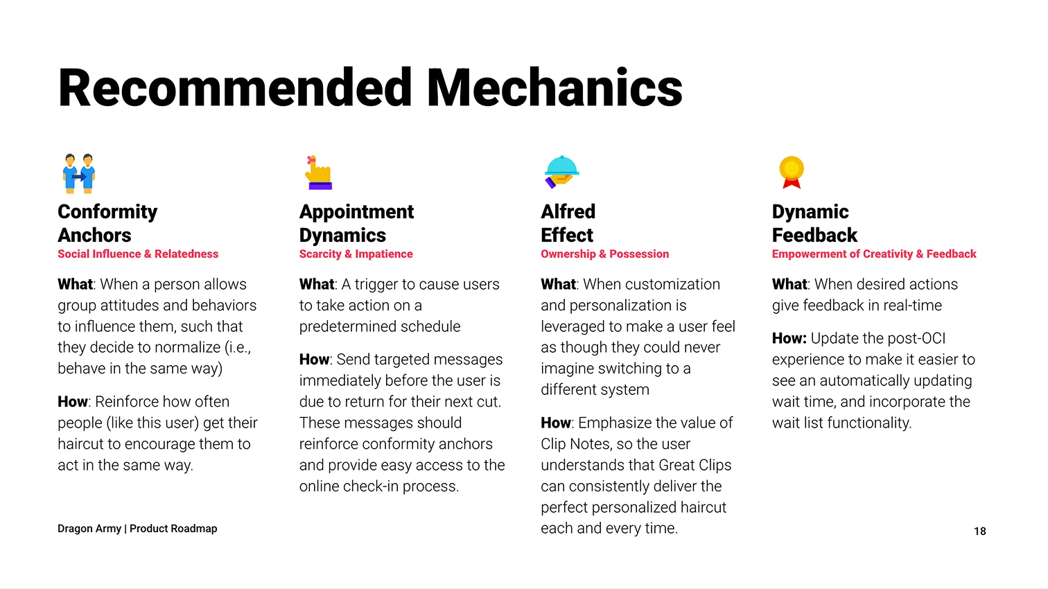
To shift that balance, I recommended four mechanics tied to specific parts of the experience, from well-timed reminders to making Clip Notes more visible, each with a plan to measure its impact.
The platform
I designed the evaluation that chose the new CMS.
I built the scoring framework and weighted formulas, gathered Great Clips’ priorities, and turned our developers’ audits into a recommendation. dotCMS scored 80% against 61% and 58% for the other finalists, at less than half their estimated three-year cost.
The design
My team and I designed the new site mobile-first, with the customer journey front and center.
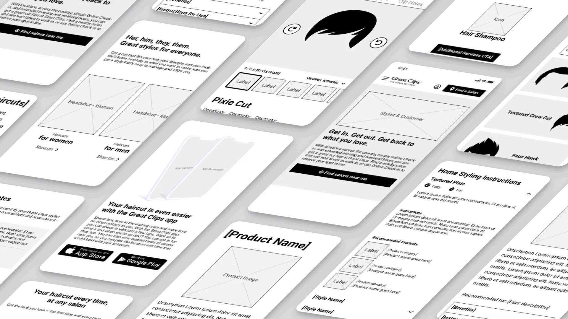
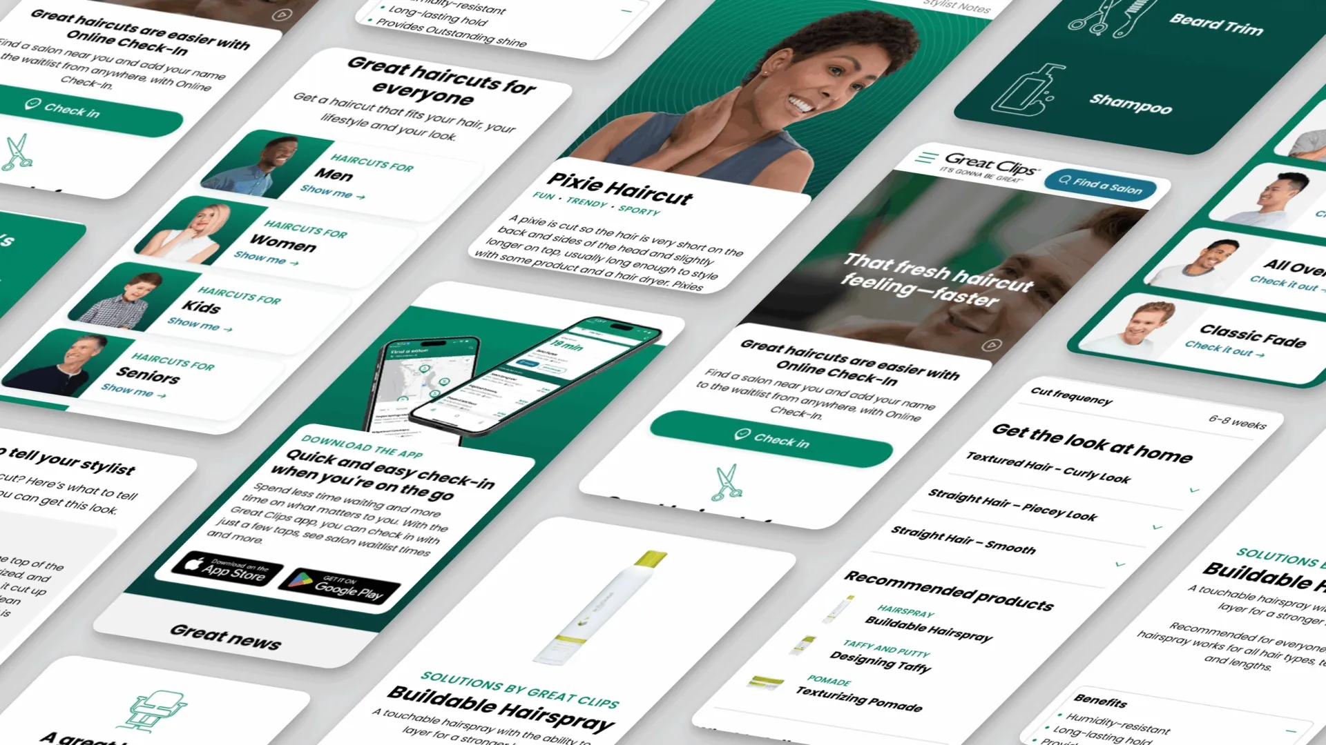
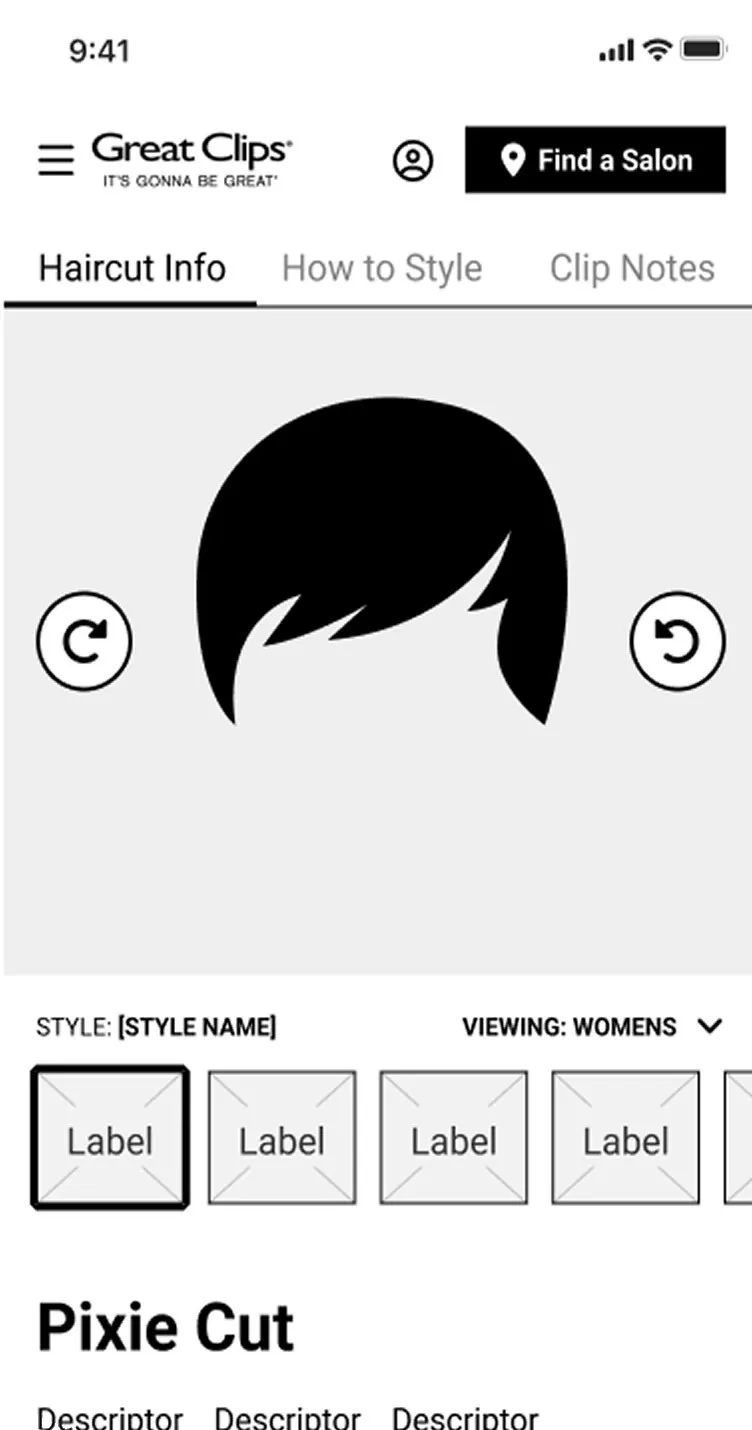
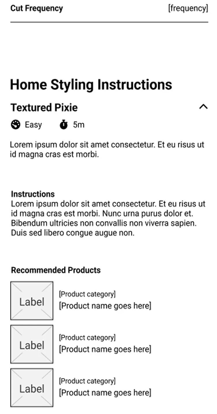
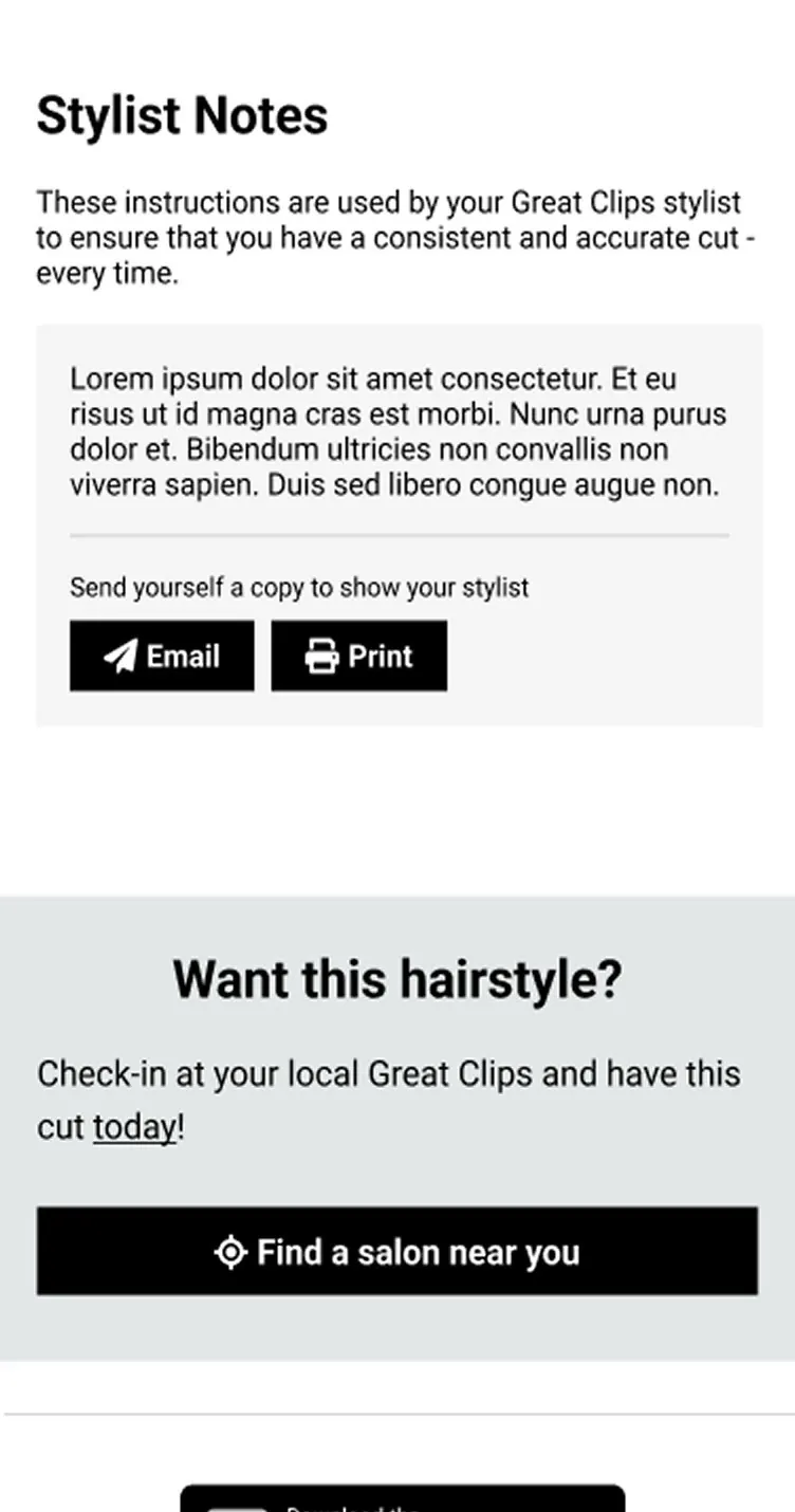
My favorite part is the lookbook, because customers didn’t ask for it. In the baseline survey, it was the least interesting of the proposed features. It stayed in the plan because the strategy called for it: style pages that show each cut, how often to trim it, how to style it, and exactly what to tell your stylist. It paid off. Mid-point testers mentioned it as a source of ideas more than twice as often as the blog, and launch testers rated its usefulness 4.72 out of 5.
Testing and iterating
The key call was recommending a change to Great Clips’ own standards.
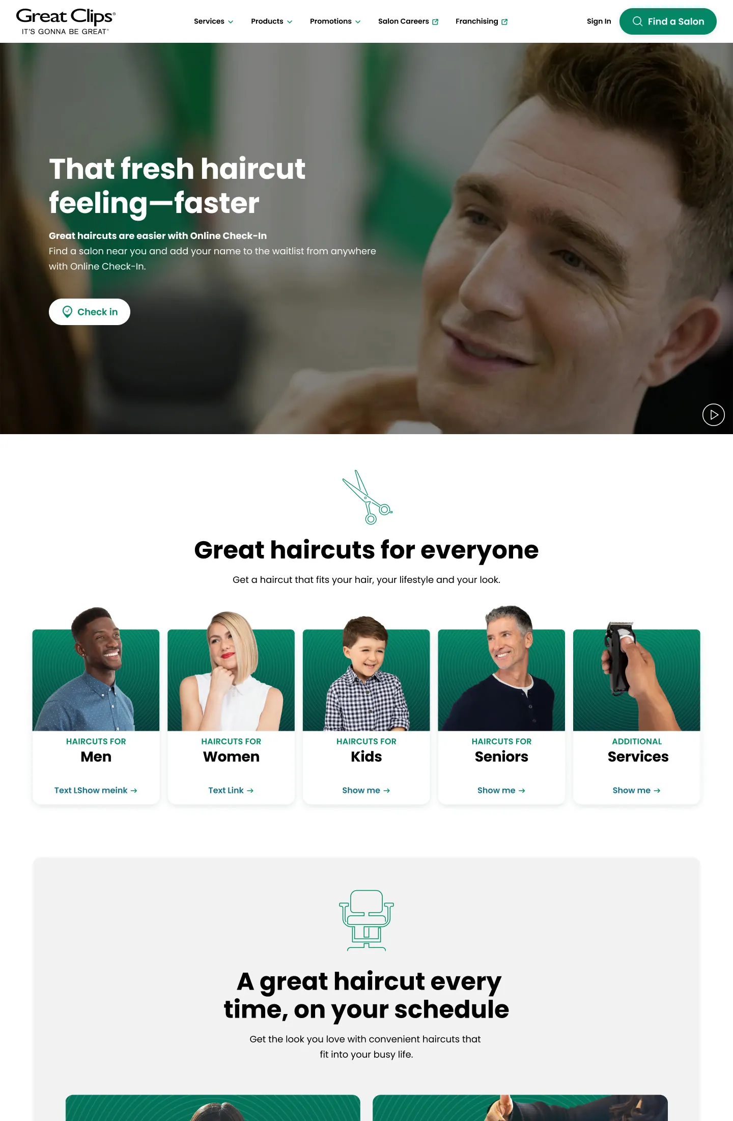
At the mid-point, we tested prototypes with 16 current and prospective customers. Great Clips’ guidelines said the homepage’s main button should read “Find a Salon.” That button was the path to check-in, but testers who weren’t logged in didn’t realize it. Asking a brand to set aside an established standard is a big ask, so we let the evidence make the case: we brought the results back to Great Clips and advocated for “Check In.” They made the change, and those two words made a real difference for our primary goal.

Launch and results
The new GreatClips.com and franchisee site launched on dotCMS, built to WCAG 2.1 AA accessibility standards.
Across three rounds of testing, the scores climbed every time. Likelihood to recommend rose from 3.4 at baseline to 4.2 at mid-point and 4.56 at launch, a 34% lift, and overall experience rose from 3.9 to 4.56. Testers who once thought Great Clips skewed male now mostly described it as a salon “for everyone.”
“Oh, this is really, really well done… That’s really neat. I mean, how do I criticize this? Wow.”
Farley, launch user study participant
What I learned
A launch this size is a team sport.
Great Clips works with separate partners for check-in and the app, SEO, localization, accessibility, cookie management, branding, social, and more. Weekly joint reviews, shared communication channels, and thorough documentation let every partner understand our work, build on it, and approve it. That rhythm mattered as much as the design itself.
Constraints shape the work, too. Customers asked for pricing in every round of testing, but franchisees set their own prices, so the site can’t show them. Instead, it leans on what every salon can promise: convenience, consistency, and a great cut.